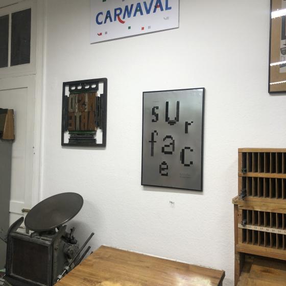
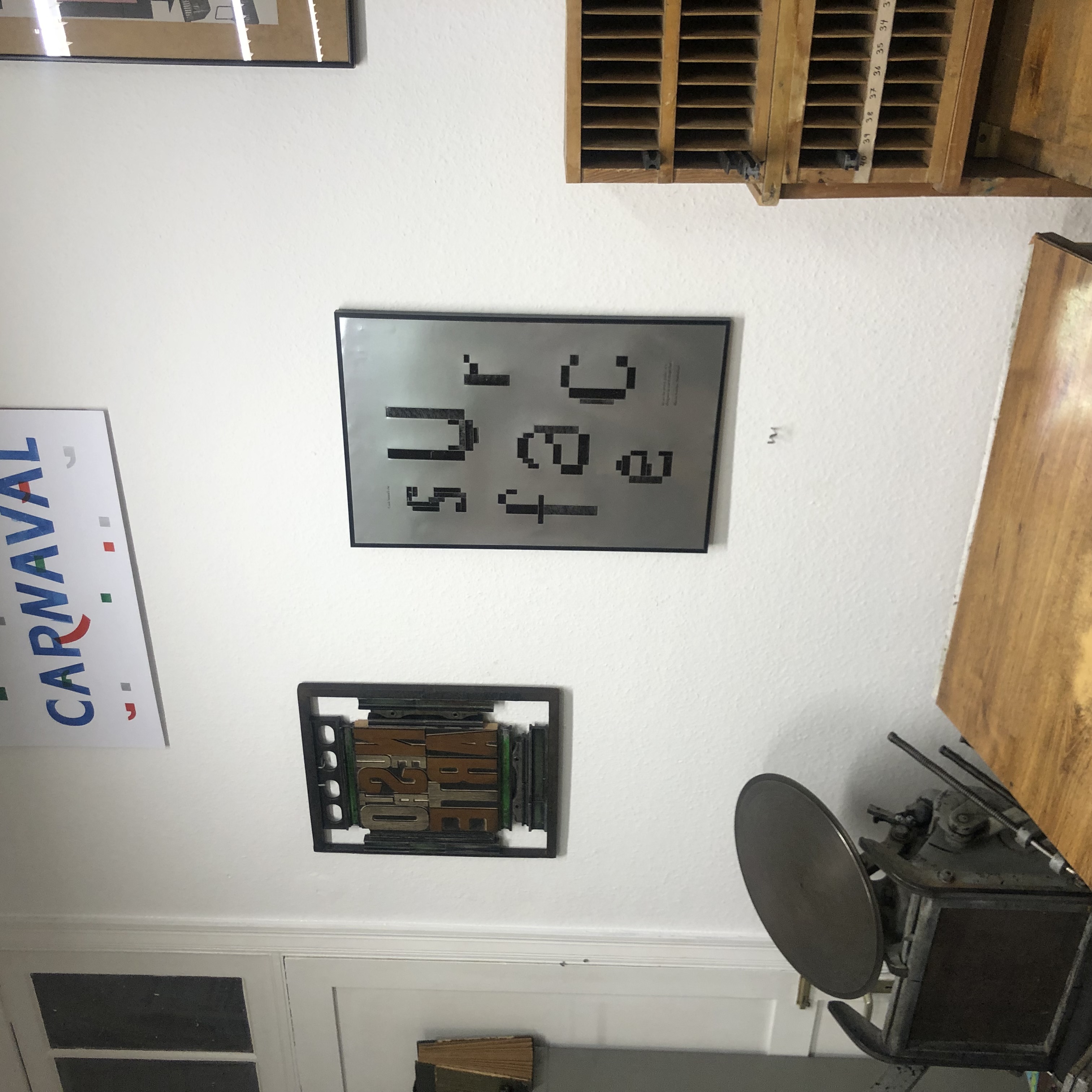
Surface
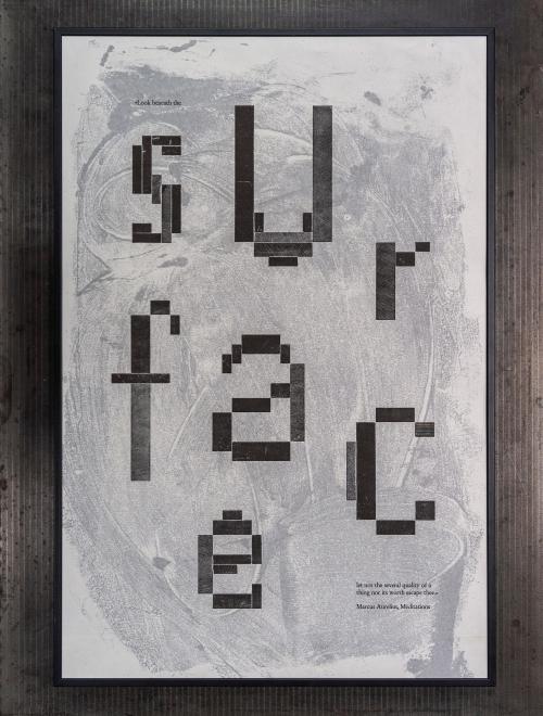
2 láminas de 40x60cm
Year: 2023
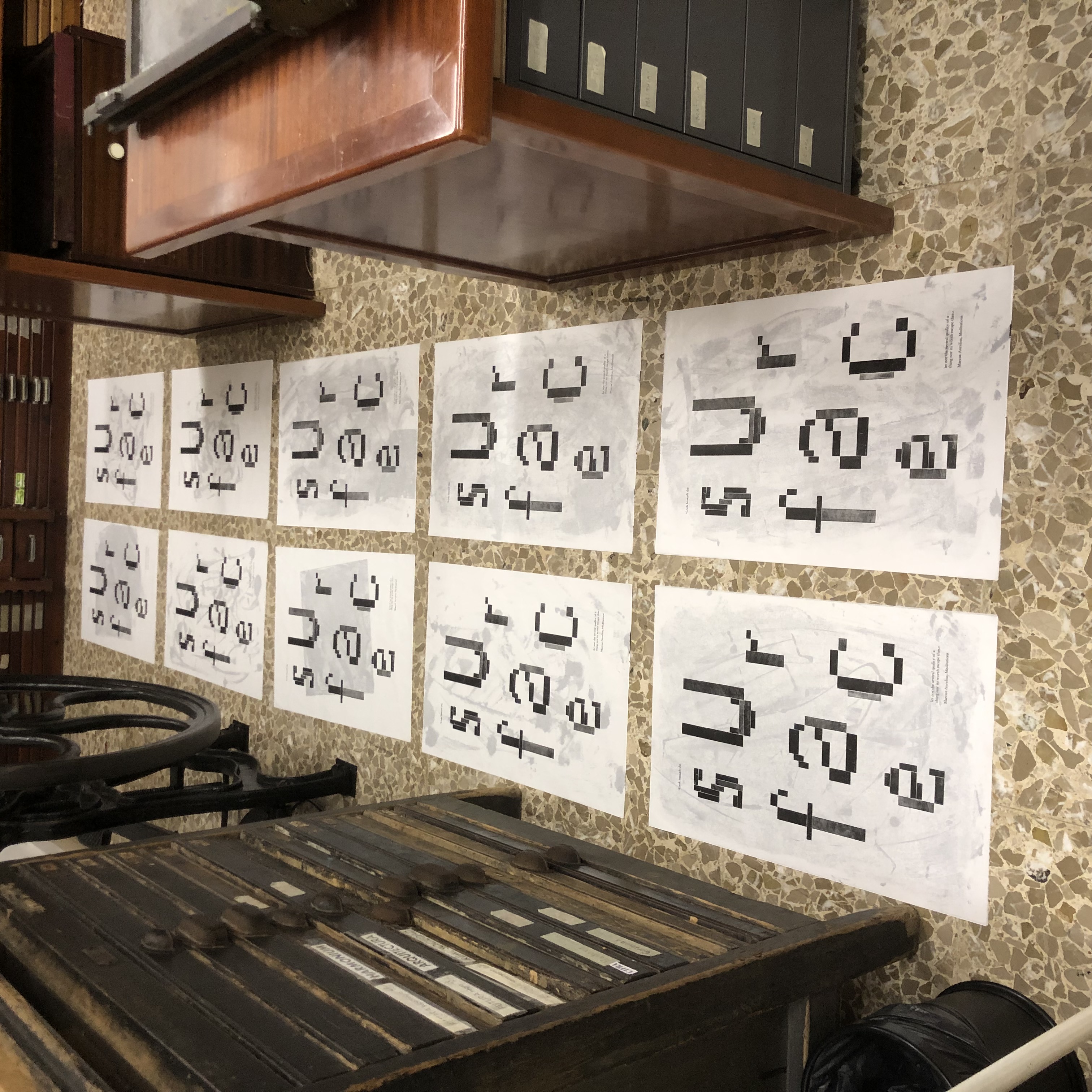
Edition of 10
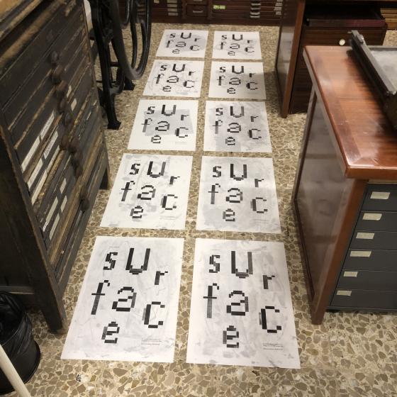
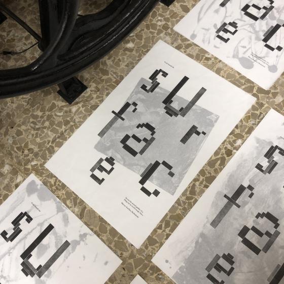
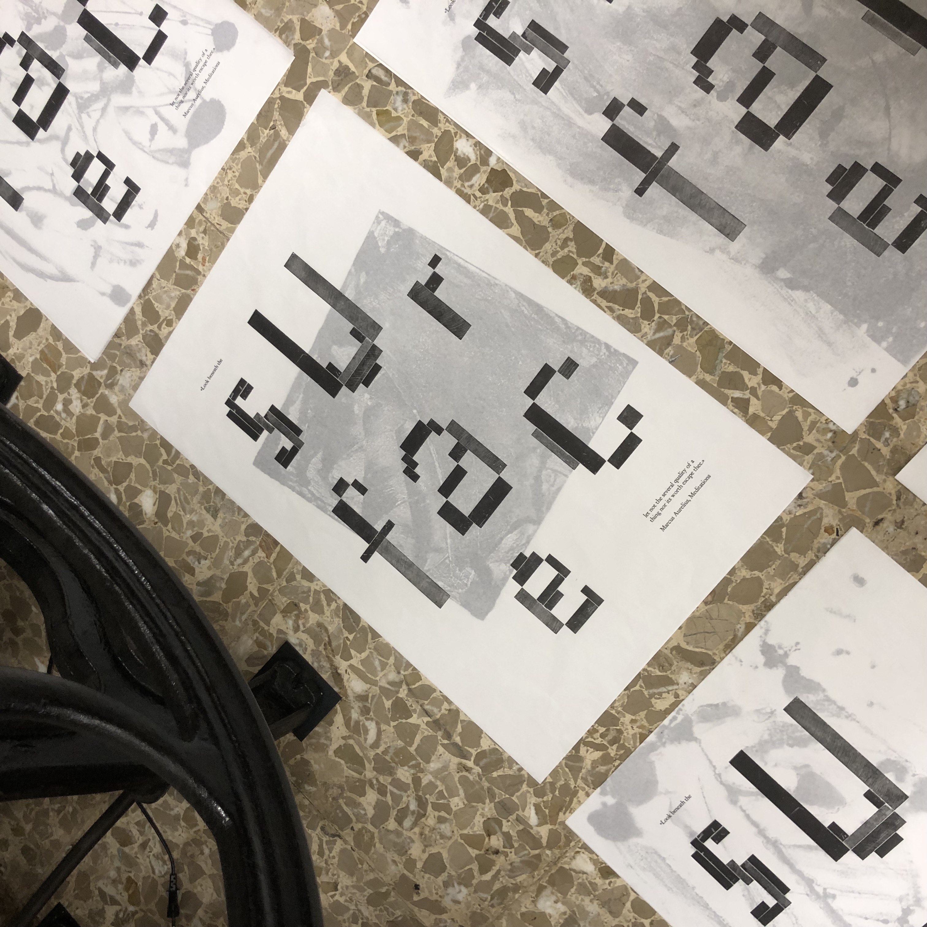
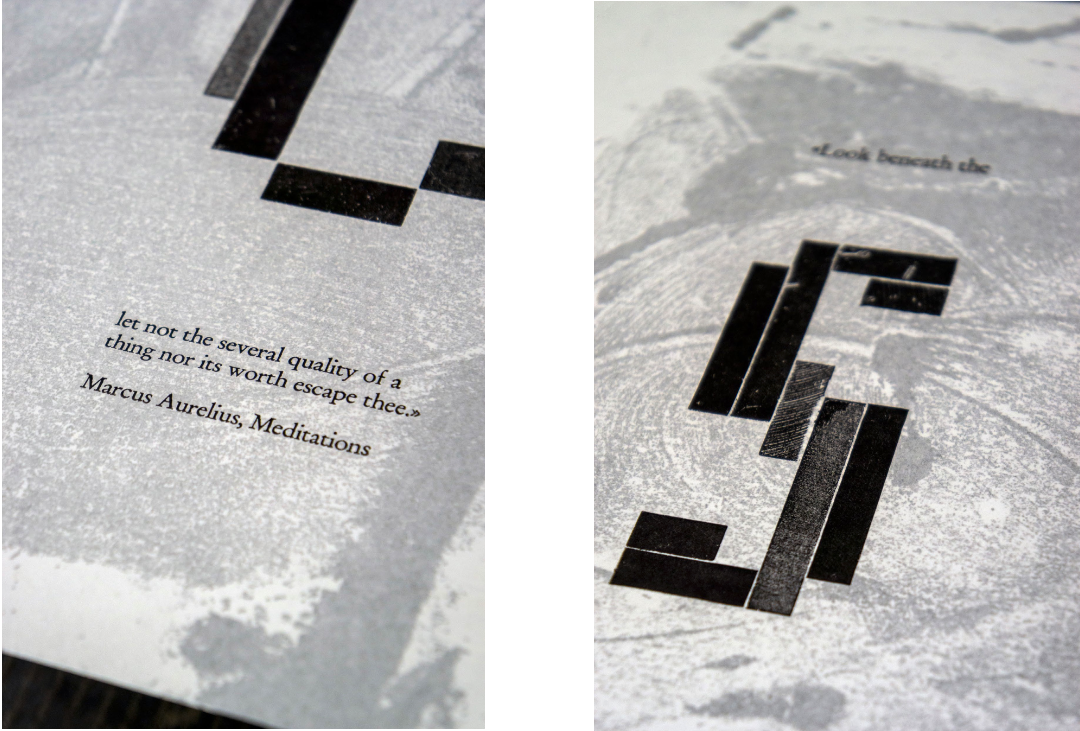
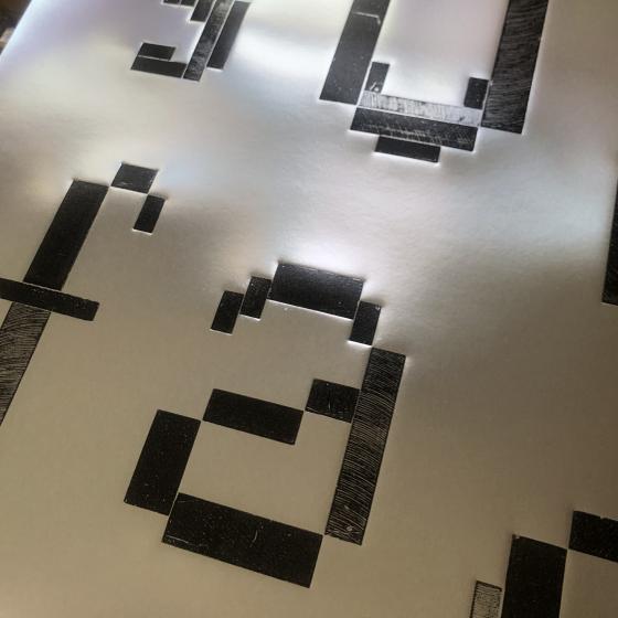
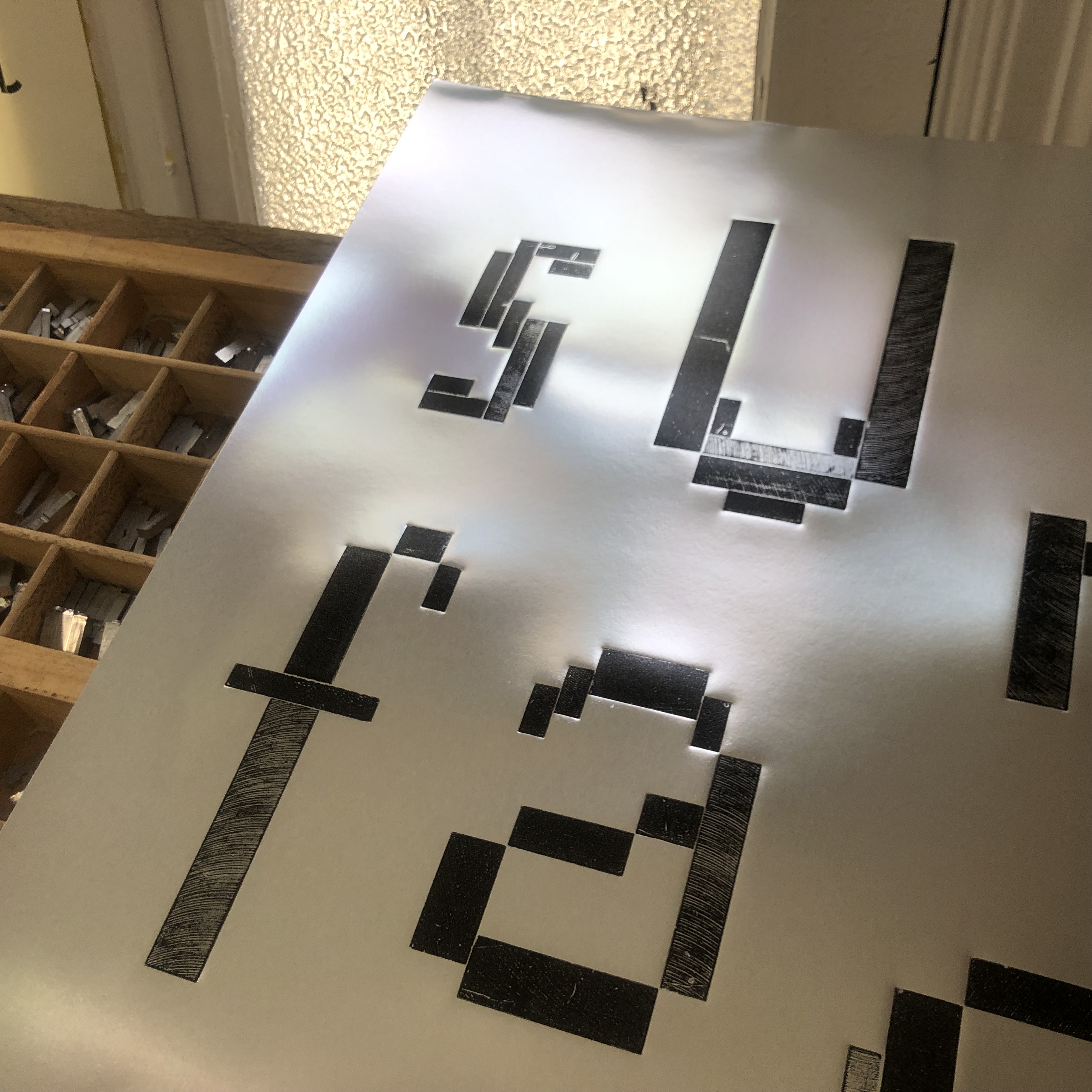
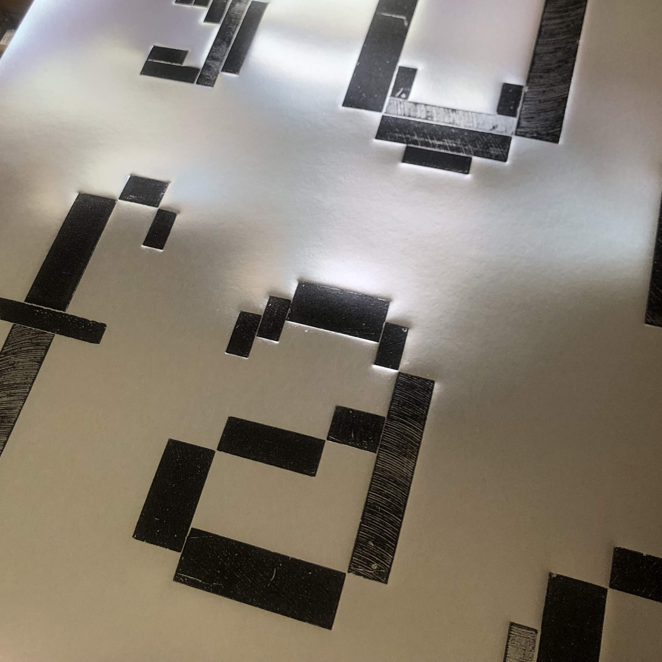
Versión A: Impresión tipográfica a una tinta impreso en papel de sed montando sobre monotipos (cada copia es distinta)
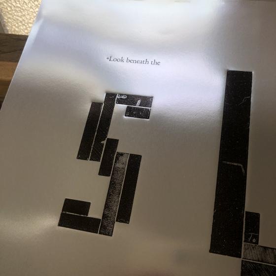
Versión B: Impresión tipográfica a una tinta impreso sobre papel especial de plata.
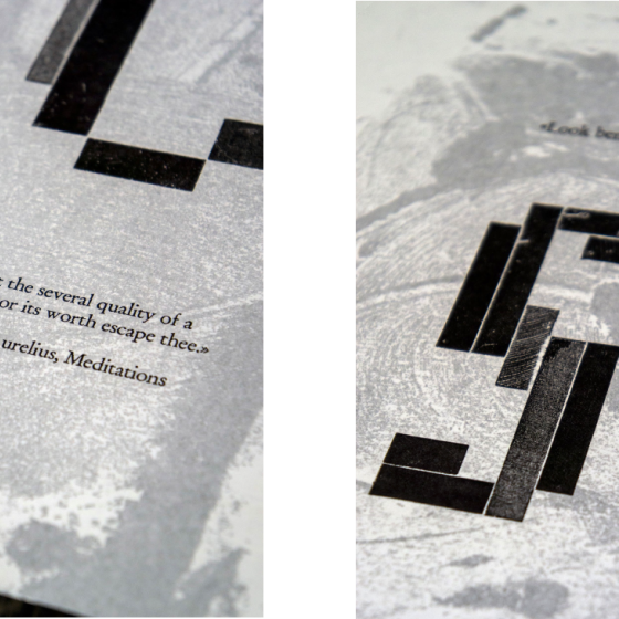
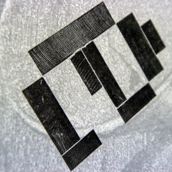
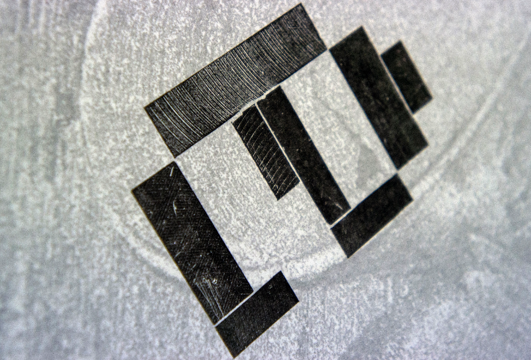
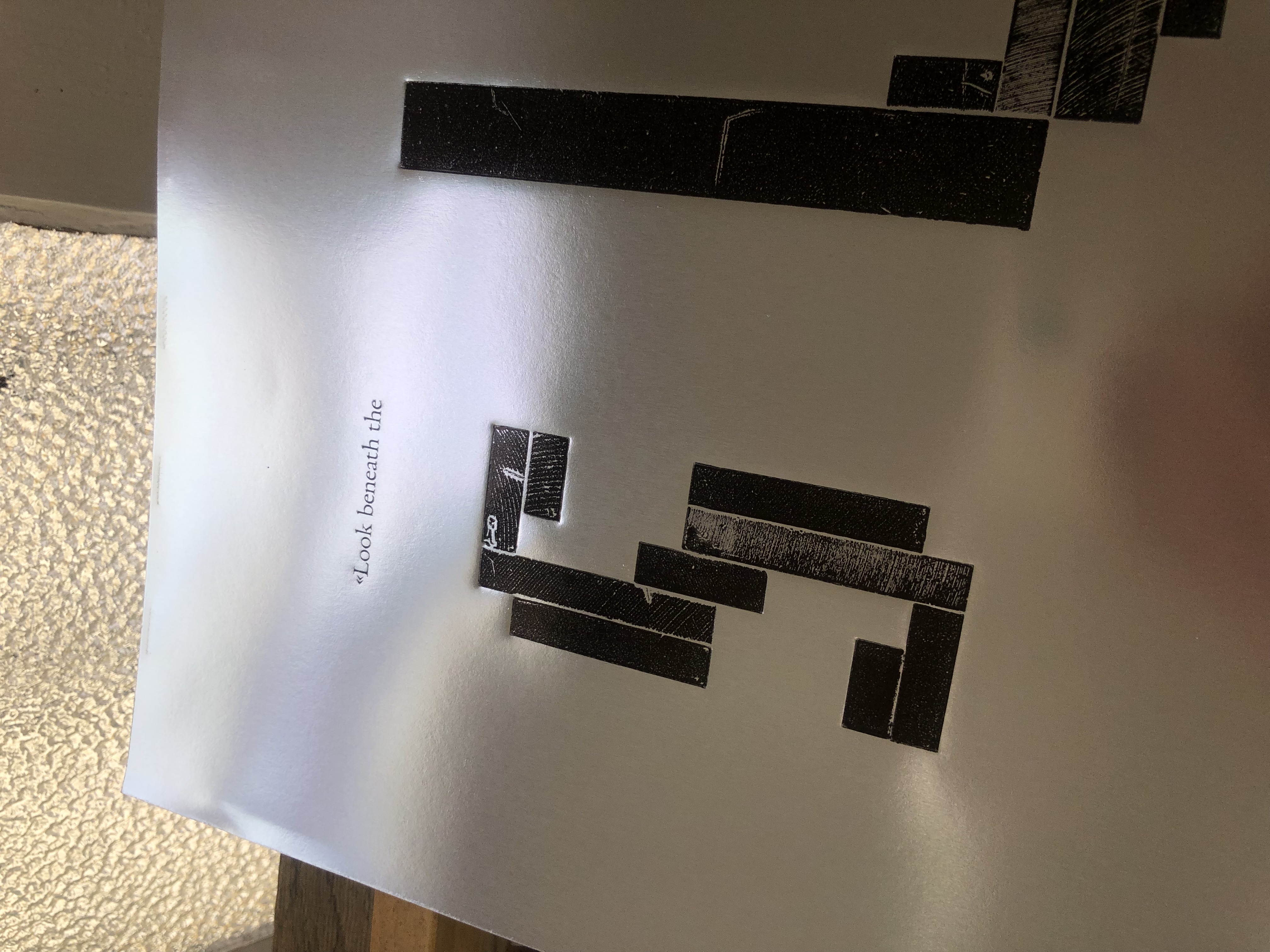
We always try to make use of existing materials and this idea came up while creating letterforms from bases originally used for mounting printing plates. They come in different sizes and can also de combined if a larger base is needed. As they are completely angular, the letters created look pixelated. However, the tool that was used to manufacture these bases back in the days has left its mark on the surface. This, in combination with wear and tear over many years, results in a curious texture. I also find it interesting to print directly from something that is actually meant to be covered up.
Playing with the word ‘surface’, I discovered a text by the great Roman philosopher-emperor Marcus Aurelius (AD 121-180) that somehow fit my way of working. The idea developed further when contrasting this new ‘type’ with real handset Garamond metal type and printing on fine, see-through tissue paper, which later was overlaid with a series of unique monotype prints created with the remaining black ink.
Version A
Version B

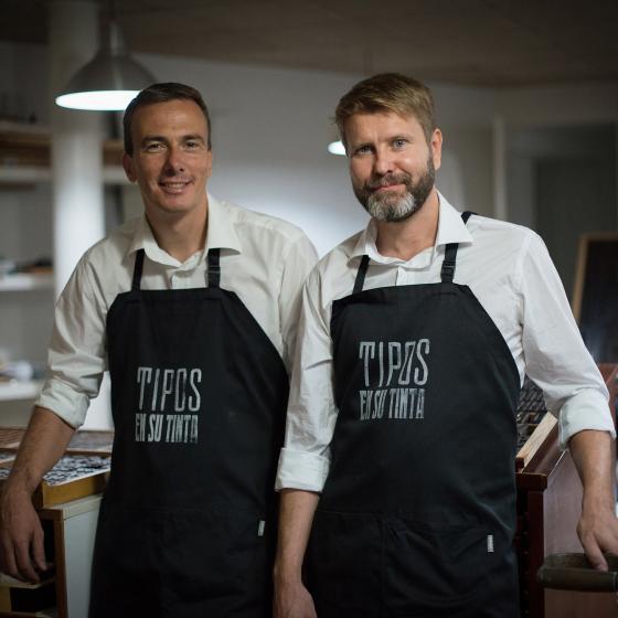
Biografía del artista
Lars P. Amundsen estudió diseño gráfico y tipografía en Central Saint Martin´s College of Art & Design en Londres. Desde el año 2003 reside en Tenerife.
