Back to Futura / Typography Rules
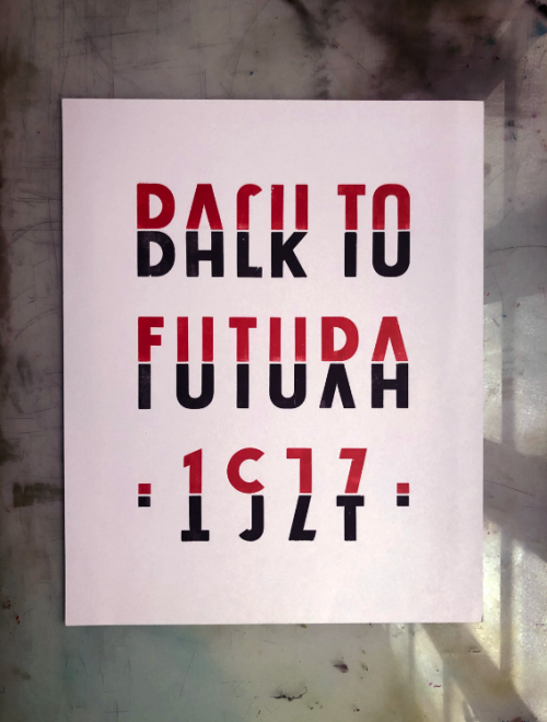
Year: 2019
35x50cm
Letterpress edition of 25 copies
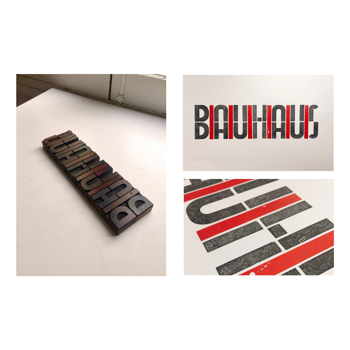
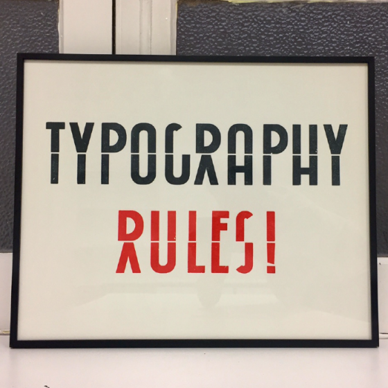
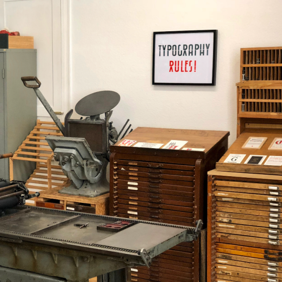
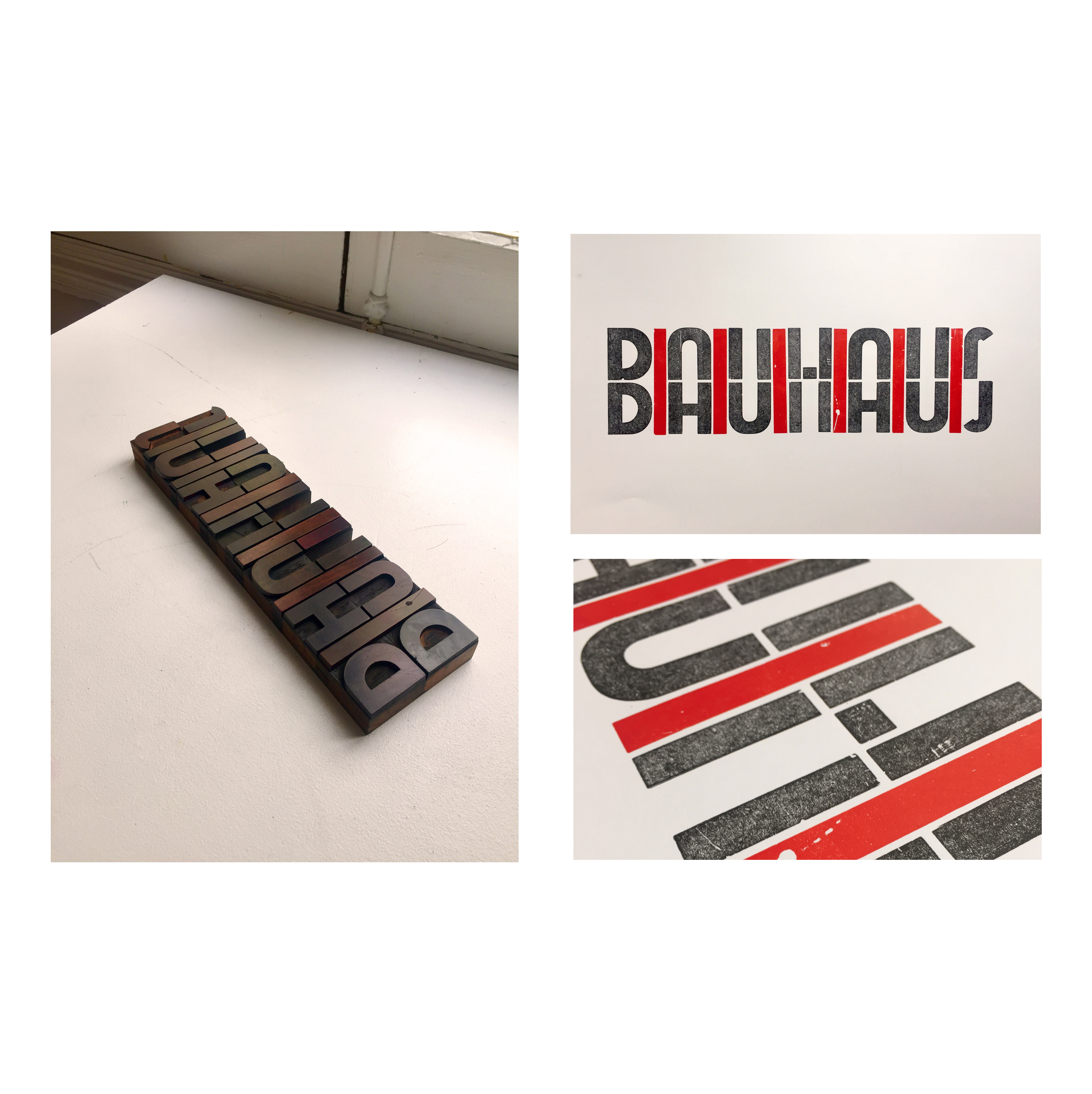
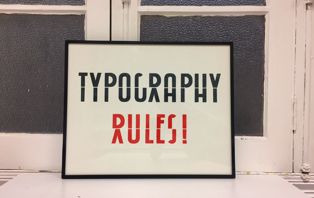
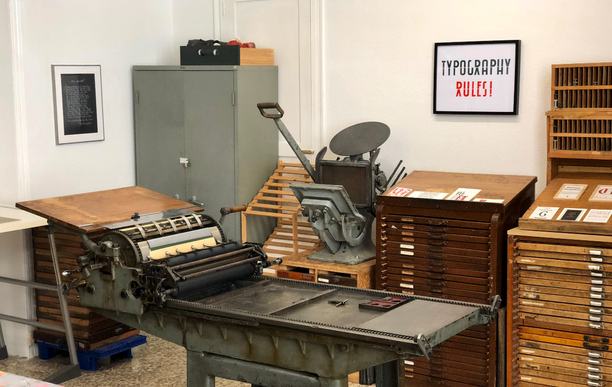
Todays letterpress workshop has a different role to the commercial printers from the old days. It serves as a place to explore typography in a tactile way and experiment with letter shapes. For a limited edition of posters, I started playing with woodblock letters of a geometric san serif typeface until I realized, that with some capital letters one can create a new “face” by putting the letters in two lines and working with the interlinear spacing. In a couple of sessions I managed to create words and short phrases. At first glance it seems illegible, but when you get the idea, you can start decoding the messages.
The project won gold in the category “Alphabet Design / Lettering / Experimental Typography” at the 5th Canary Islands Design Awards.
Biografía del artista
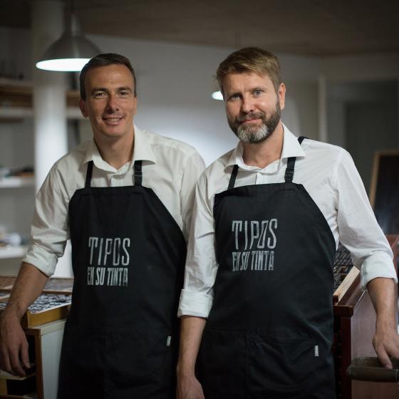
Lars P. Amundsen estudió diseño gráfico y tipografía en Central Saint Martin´s College of Art & Design en Londres. Desde el año 2003 reside en Tenerife.
